Cowzy Friday: UI Image swapping!
- Wesley Chartrand
- Mar 28, 2025
- 3 min read

Welcome back to another Cowzy Friday update! This week, I've been focused on the UI a bit more, while also working on implementing functionality! Let's get into it!
Toolbar UI: Swapping button images
One of the latest changes is interacting with the buttons in our scene! When selecting a button in the toolbar, we now switch to the "selected" version of that button!
It's a fairly small thing, but it's a good way to show when we've selected something or not! This also works when pressing the "1" key! In the future, I'd like to be able to cycle through the options with shortcuts ala Tiny Glade!

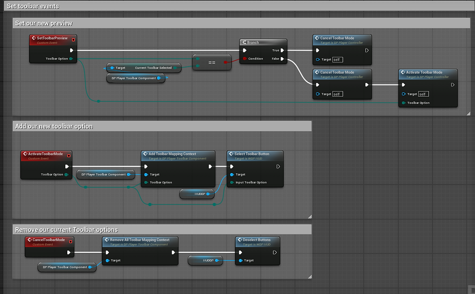
Toolbar UI: How do we switch?
When switching the image, it's as simple as changing up the Style, which is defined in our individual Toolbar Widgets! We have two variations of this:
We predefine a select/deselect in our parent class since all of the button panels will have a toolbar widget button on the primary toolbar
We then have a select widget that will handle the actual option buttons in the individual option panels.
Panels handle widget deselection individually because some panels may have buttons or sliders or other widgets which require their own Style treatment

I try to follow the same steps for every activation, but these are the steps:
We activate our UI by either:
Pressing the relevant shortcut
Clicking the Toolbar button
Clicking any button in the Options Menu for a button.
When activated, the BP_PlayerController has the SetToolbarPreview selected. We then:
Disable any current build preview we have.
If we're activating a new one, we then add our context mapping and activate our new preview mode (in this case, building)
Then we deselect our toolbar buttons and enable the currently selected one
This also introduces a weakness where we loop through all of our options, but this is OK as we will only have 10 or less options so it's not an expensive operation.

Toolbar UI: Why this way?
The entire system is scalable. If we want to add a new button, all we need to do is:
Create a child of BP_ToolbarButtonPanel and BP_ToolbarOptions Panel
Define the Style's for those, all of the UX related setup.
In the new BP_ToolbarOptions that is created, have your selected buttons call the EDispatchOnRelease that automatically created due to the parent/child relationship.

In the new BP_ToolbarButtonPanel, have the event for that EDispatch call our preview.

And then in our HUD, that dispatch is called!

As you can see, if you want to add in more buttons, it quite literally is as simple as UX setup, and a few dispatch calls in a few blueprints. It took a lot of work to get it setup this way, but now I could easily add in a dozen buttons in no time with this method!
Next Steps: Expanding UI Functionality 🛠️
Although I wanted this for last week, my main focus is on making the Toolbar interactive and doing some Blueprint cleanup.
Allowing players to select different buildings
Base functional path creation mode
Cleaning up older Blueprints, removing obsolete ones.
Closing Thoughts
I mentioned this last week, but I spent a lot of time making my UI scalable and easier to work with. Perfect certainly felt like the enemy of done here, plus being really sick for almost two weeks didn't help. Now that I'm over that, I'll be able to hyper focus on expanding the functionality and getting closer to that basic demo!!
Thanks for joining me this Cowzy Friday! 🏡🐄


Comments